

Engineering
Building a Mobile-First Job Discovery Product
Product principles for making job discovery faster, clearer, and more useful for candidates.
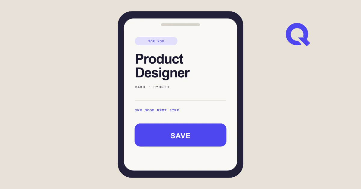
A mobile-first recruitment product is not a desktop vacancy board compressed into a narrow screen. Candidates use a phone in short, interrupted sessions: during a commute, between other tasks, or after receiving a message about an opening. The interface must help them understand whether an opportunity is relevant, remember it, and choose the right next action without demanding a long browsing session.
Hirinq starts from that candidate behaviour. Opportunities are distributed across employer pages, recruitment sites, social channels, and other publishing formats. Bringing them together is valuable only if the resulting experience is clearer than visiting each source separately.
Design for decisions, not scrolling volume
Traditional vacancy lists reward density. They show many rows, filters, promotional blocks, and pagination controls at once. On a phone, density quickly becomes repetition. Titles are truncated, employer context disappears, and candidates open several pages just to learn basic facts.
A discovery flow should instead answer a small set of questions in a stable order:
- What is the role?
- Who is hiring?
- Where and how is the work performed?
- Why might this opportunity fit me?
- What can I do next?
The first card does not need the entire vacancy description. It needs enough information for a confident next step. Progressive disclosure can reveal responsibilities, requirements, benefits, and source details after interest is established. This keeps the discovery rhythm fast while preserving access to the original information.
Swipe-based interaction can support that rhythm, but the gesture is not the product. Every swipe needs an accessible button equivalent, clear labels, undo where practical, and predictable saved-state behaviour. Motion should reinforce direction and outcome, respect reduced-motion preferences, and never obscure the vacancy content.
Normalize the market without flattening it
Multi-source coverage introduces inconsistent titles, location formats, languages, salary notation, and application instructions. A candidate should not have to learn each publisher's conventions. Hirinq can normalize common fields so filters and comparisons behave consistently, while preserving the original wording when it carries meaning.
Language deserves particular care. More than one language can appear in recruitment. Search and matching should handle that reality without rewriting every vacancy into generic text. The interface can present structured facts consistently while leaving the source description intact and clearly attributed.
Location is similarly nuanced. "Baku," a specific district, hybrid work, and fully remote work are not interchangeable. The product should make location and workplace arrangement visible early, because they often determine relevance before a candidate reads further.
Make saving part of discovery
Candidates are not always ready to apply when they find a good role. A saved opportunity is therefore not a secondary bookmark feature; it is part of the core decision loop. Saving should be immediate, reversible, and synchronized with the vacancy's current state.
The saved view should help a candidate resume thinking. Useful context includes when the opportunity was saved, whether its source has changed, which application route is available, and whether the vacancy appears to have closed. The system should avoid artificial urgency. A real closing date can be shown when available, but the interface should not invent countdowns or scarcity.
Application activity also benefits from simple states. A candidate may have viewed, saved, started, or completed an application. Hirinq can help track those actions without claiming access to employer decisions it cannot observe. The distinction protects trust: "application opened" and "application received by the employer" are not automatically the same event.
Respect different application paths
Vacancies do not share one universal apply button. Some employers accept a direct application, others request email, and many send candidates to an external form. The mobile experience should make that difference clear before a candidate commits time.
For email applications, the product can help open a correctly addressed message while allowing the candidate to review attachments and text. For external applications, it should explain that the user is leaving Hirinq and preserve enough state to return. For direct flows, form fields should be concise, accessible, and honest about what will be submitted.
The best route is not always the shortest route. When an employer-owned destination is available and trustworthy, it may offer the most current requirements. A candidate-focused product should prioritize clarity and reliability over keeping every interaction inside its own interface.
Personalization needs understandable controls
Recommendations become useful when they reduce irrelevant work, not when they create a mysterious feed. Candidates should be able to express role interests, location preferences, experience level, and work arrangement, then adjust those preferences as their search changes.
Behavioural signals such as saves and dismissals can improve ordering, but explicit choices should remain visible. A person may dismiss a suitable role because the timing is wrong, not because the occupation is irrelevant. Treating every action as a permanent preference can make the feed narrower and less useful.
The product should also explain recommendation factors in plain language where possible: matching role area, preferred location, relevant experience, or similar saved opportunities. Explanations do not need to reveal a scoring formula. They need to give the candidate a reason to trust and correct the result.
Build for variable networks and devices
Mobile-first also means performance-first. Vacancy cards should not wait for large images or unnecessary scripts. Stable dimensions prevent layout shifts, cached structured data supports quick return visits, and resilient loading states keep the interface understandable on slower connections.
Core actions must remain keyboard accessible and screen-reader friendly. Tap targets need adequate size. Error states should preserve entered data. Authentication, if required, should not interrupt basic exploration earlier than necessary. These are not finishing details; they determine whether the product works for the full range of candidates it intends to serve.
Hirinq's goal is a recruitment experience that can work across markets without becoming generic. It should respect different languages and sources, simplify fragmented discovery, and fit the real moments when candidates use a phone. The same product principles can adapt to new publishing systems, application norms, and candidate expectations.